iPhone Duo: how to prepare your existing app
A foldable phone changes the space available to apps. What does iPhone Duo bring, and which displays and layouts matter when preparing your iOS app?
 Libor ZapletalOctober 11, 20268 min read
- iOS
- Foldable phones
- UX
- Design
- App maintenance
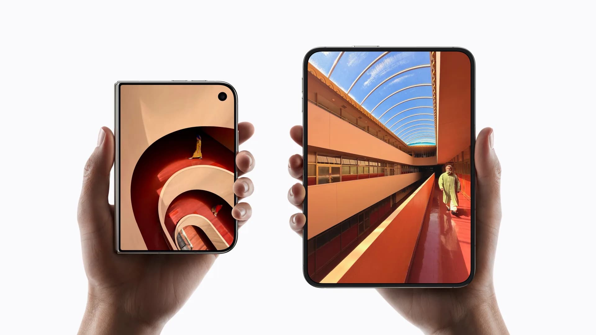
Foldable phones are changing how we use apps
A phone that fits in your pocket but opens up to give you more room to work. Foldable displays bring these two needs together in one device. Foldable Android phones have been around for a while, and now Apple is joining them with iPhone Duo. Foldable phones will likely become more common, giving developers more reason to focus on them when building apps.
For users, a larger screen can mean more comfortable reading, a clearer map or a list of items alongside their details. For app owners, it is an opportunity to check whether the interface supports this kind of use. We recommend starting with the tasks people do most often: searching, browsing content, filling out forms or completing an order.
What is iPhone Duo?
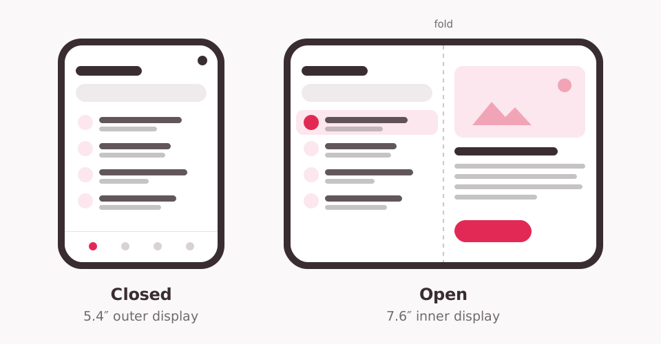
iPhone Duo is the first foldable iPhone. Apple introduced it on September 9, 2026. When closed, it offers an outer 5.4-inch display; when opened, an inner foldable display measuring 7.6 inches diagonally. The larger screen also allows two apps to run side by side.
When preparing an existing app, the key change is the available space and controls. Apps you already have on the App Store work on iPhone Duo without modifications. To look good and make full use of both displays, though, they benefit from an update for iOS 27.1 and a check of how they behave in different phone positions.
Which displays and layouts to focus on
iPhone Duo has two physical displays. When preparing an app, we also recommend checking situations where the available space shrinks or the phone remains partially folded.
| Display or use case | What to focus on when checking the app |
|---|---|
| Outer display · 5.4″ | Content readability, access to the main actions and placement of controls. The display is wider and shorter than on a regular iPhone. |
| Inner display · 7.6″ | Making use of the larger space. Where helpful, show a list and details side by side, for example, or arrange content in two columns. |
| Two apps side by side | A clear interface in a smaller window and access to all necessary features. |
| Partially folded phone | Comfortable operation and placement of important buttons away from the fold. |
In many phone positions, Apple moves navigation and controls to the side edge. The interface must therefore respect the space reserved for controls and system elements. Apple's recommendations are based on adapting to the available width, rather than designing a fixed layout for each phone position.
The review should also cover opening and closing the phone during a task. Users should still see their selected item, unfinished text or order in progress and be able to continue smoothly. The same task should be possible to complete on both displays.
What this looks like in practice
When we test our apps on iPhone Duo, we keep seeing three situations. The same app can appear in three ways on the unfolded phone, depending on whether and how we adapt it.
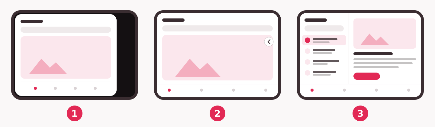
- Without an update, the app runs in a frame. It works, but does not use the large display fully, leaving a black strip at the edge.
- After an update without further modifications, it fills the entire display. The interface simply stretches, though: only one large card fits across the width, and some buttons may overlap the content.
- After adapting the interface, the app shows more content at once, such as a list alongside the selected item's details. Users do not need to go back and forth.
Which changes make sense
Not every app needs a major overhaul. We recommend grouping changes by effort and starting with what gets in the user's way most on the new display.
| Effort | Change | When it is worthwhile |
|---|---|---|
| Small | Move buttons away from the system strip at the edge of the display. Limit the width of text and forms so they do not stretch across the large display. | Always, with the first update for iPhone Duo. |
| Medium | Replace one card per row with a grid of two to three columns. | For catalogs, listings, photo galleries and other overview screens. |
| Larger | Show a list alongside its details and adapt navigation for the large display. | For apps where people often browse a list and open details, such as online stores, classified listings, news or bookings. |
Sometimes the update alone is enough. The Kimbino app uses the standard system tab bar, so after an update for iOS 27.1 it automatically becomes a vertical panel at the edge of the outer display. Content does not extend underneath it, and the app immediately uses the entire display.
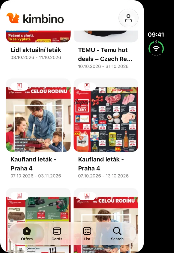 Without an update
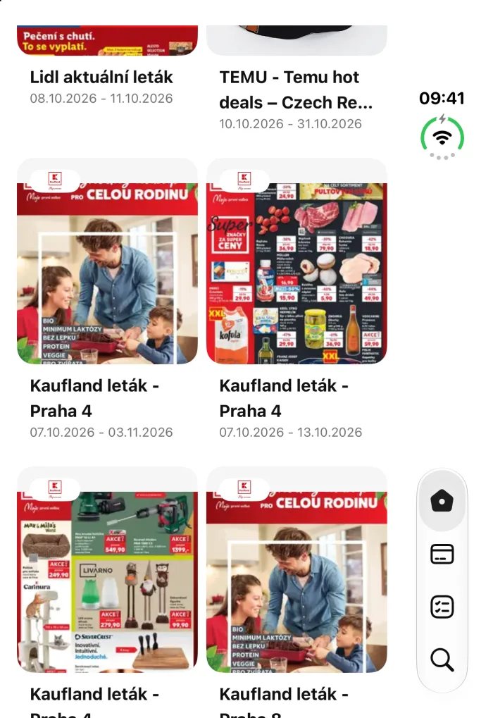 After an update for iOS 27.1
Some of the work is already done if the app chooses its layout based on the available width rather than the device type. Such an app will largely adapt to the large display on its own, much as it does on a tablet. Web-based parts of the app behave the same way.
Older apps with fixed layouts, on the other hand, do not adapt on their own. After an update, they fill the entire display, but cards and photos remain narrow, leaving empty space alongside them, and some buttons disappear. Some older apps will not even launch after an update until their underlying technology is updated. These require more work.
A larger change alters the layout itself. A single long list that would simply stretch across the unfolded phone can become a list on the left and the selected item's details on the right. This is how it could look in the STVR podcast app: show episodes on the left, a player for the selected episode on the right, and no switching between screens.
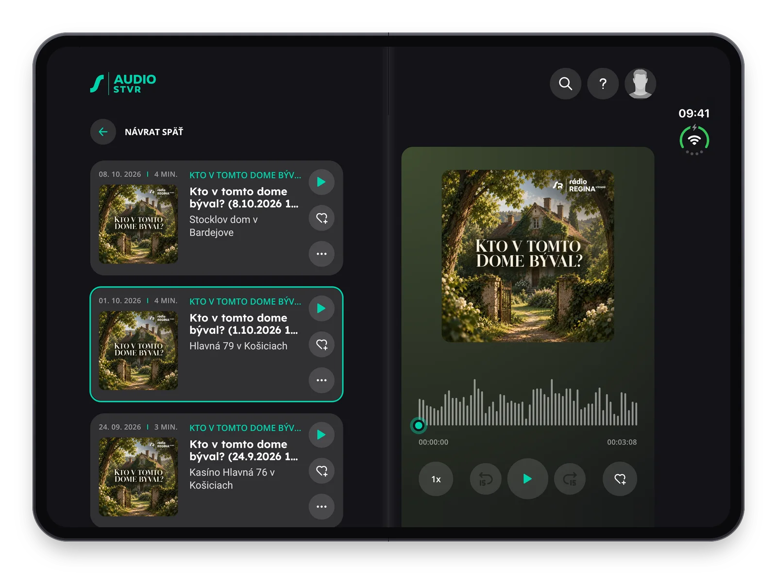
The vertical strip at the right edge remains an open question. Apple does not give it a particular name, but on the outer display and in many phone positions, the system moves app controls into it: the tab bar, the back button and buttons from the top and bottom toolbars. It shares the strip with the clock, battery status and other system elements. In the STVR concept, it remained almost empty because the app has its own header. Search or a profile could move there, for example.
There are other changes to controls worth checking:
- System controls move into the strip automatically. Custom bars and buttons need to be adapted manually.
- Wide text buttons and switches stay in the top bar because they do not fit in the narrow strip. The system puts anything that does not fit in the strip into a menu.
- On the inner display in portrait orientation, bars remain horizontal; in other positions, controls move to the edge. Features should still stay the same in every position.
- With two apps side by side, controls sit at the outer edge. The app on the left has them at the left edge.
- The fold should not have any buttons crossing it. System controls avoid it automatically; custom controls need to be moved.
Conclusion
Apple will begin selling iPhone Duo on October 23, 2026, in more than 70 countries, with more to follow on October 30. Existing apps will run on it without modifications, but in a frame. An update for iOS 27.1 and changes to the interface will help them make full use of both displays.
We recommend three steps: check that the app works in a frame, fix anything that gets in the way on the new display with the update for iOS 27.1, and add larger changes gradually.
People will be discovering how the new phone works best for them: closed in one hand, open for reading, or partially folded and propped on a table. We can then keep adapting your app based on how they actually use it.
Want to know how your app looks on iPhone Duo? We will test it on both displays and prepare a list of recommended changes with an estimate of the effort involved. Get in touch.

Builds our apps for iPhone and iPad. He saw the potential of Apple's platforms and has focused on iOS development ever since.
More about the team →

Have an idea?
Leave us a message or give us a call — we'll get back to you promptly and discuss how to turn it into an app or website.